Web Design Company in Mumbai, India – Devki Infotech India Pvt. Ltd.
Web Design Company in Mumbai, India – Devki Infotech India Pvt. Ltd.
Experience the best responsive web design services in Mumbai, India, with Devki Infotech—where innovation meets precision. Our expert team delivers dynamic, mobile-friendly websites and comprehensive development and SEO solutions that captivate and engage users across all devices.
At Devki Infotech – Web Design Company in Mumbai, India we offer comprehensive responsive website design services that ensure your online presence is both visually appealing and highly functional across all devices.
Our team of skilled web designers and developers focuses on ensuring a flawless user experience across desktops, tablets, and smartphones, leveraging cutting-edge technology and innovative design principles. Whether you want to revamp your online presence or launch a new site, we provide tailored solutions that drive engagement and deliver results.
Beyond design and development, we offer ongoing support and maintenance to keep your website updated and functioning flawlessly. Whether you need regular updates, bug fixes, or enhancements to meet evolving user needs, our team is committed to providing exceptional service and ensuring your site remains at the forefront of web design trends. Partner with us to create a responsive website that not only looks great but also performs effectively across all platforms, driving success and growth for your business.
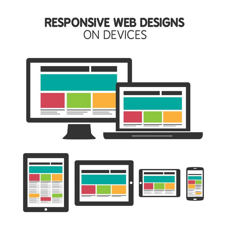
Responsive website design is a smart way of building websites that automatically adjust to fit any screen size, like those on your phone, tablet, or computer.
It ensures that your website looks great and works well, no matter how someone accesses it. This means users get a seamless experience, whether they’re browsing on a tiny smartphone or a big desktop monitor.
Mobile-friendly web design typically involves creating a separate version of the website specifically tailored for mobile devices. This often means creating a simplified version of the main website with fewer features, smaller images, and a more streamlined layout optimized for smaller screens.
Mobile-friendly websites may use techniques like dynamic serving or separate mobile subdomains (e.g., m.example.com) to deliver the mobile-optimized version to users accessing the site from mobile devices.


Responsive websites are crafted to automatically adjust to different screen sizes and devices, providing an optimal viewing and interaction experience whether users are on desktops, laptops, tablets, or smartphones.

Over 1.2 billion people use mobile devices to access information online all over the world
Tailored Website Development: We specialize in creating custom websites that cater specifically to your business needs and objectives. Whether you’re a small startup or a large enterprise, we’ll work closely with you to understand your requirements and develop a unique website that sets you apart from the competition.
Scalable Solutions: Our custom website development solutions are designed to grow with your business. We build scalable websites that can accommodate your expanding needs, whether it’s adding new features, scaling up to handle increased traffic, or integrating with third-party systems.
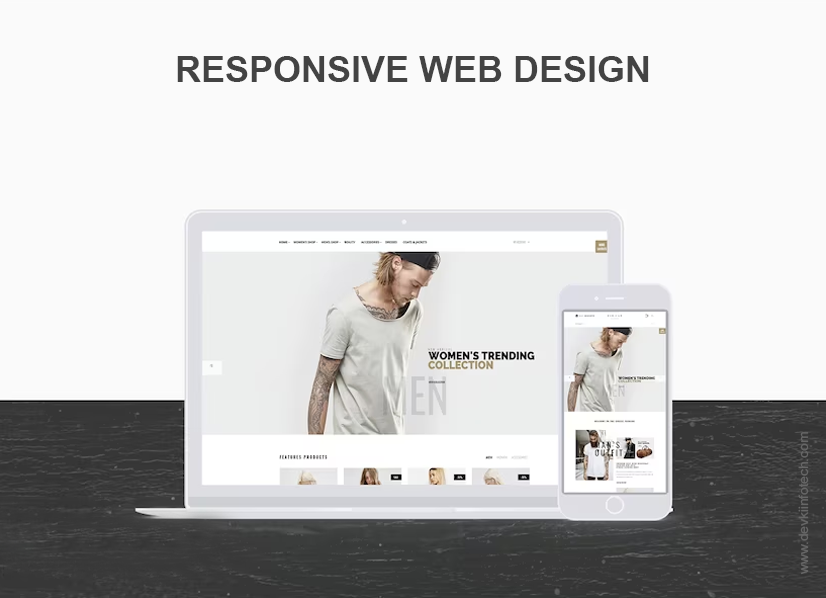
Responsive Design: In today’s mobile-driven world, it’s essential to have a website that looks great and functions seamlessly on all devices. We ensure that your custom website is responsive, providing an optimal viewing experience across desktops, laptops, tablets, and smartphones.
SEO-Friendly Development: Our custom websites are built with search engine optimization (SEO) in mind. We follow best practices for on-page optimization, site structure, and performance optimization to ensure that your website ranks well in search engine results and attracts organic traffic.

Requirements gathering
Website Prototype Design
Website Coding & Testing
Launch, Beta Live, & Live
Monitoring, Analysis & Support
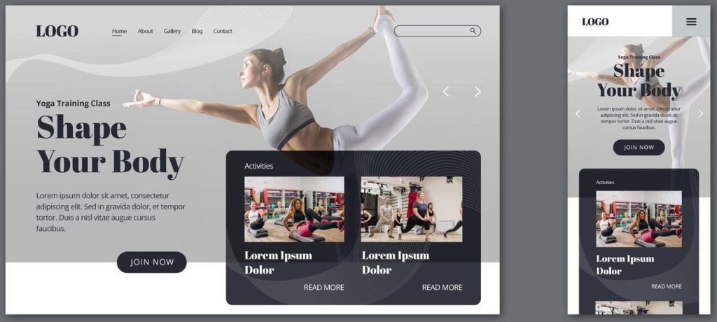
Crafting websites that seamlessly adapt to different screen sizes and devices.
Tailored website solutions to meet unique business requirements and brand identities.
Creating user-friendly online stores with secure payment gateways and intuitive navigation.
Web hosting services are like renting space on a server where your website files are stored .
Dynamic, scalable, and visually appealing websites, tailored to meet specific business needs and objectives.
Providing ongoing maintenance and support services to ensure websites remain functional and up-to-date.
Secure Your Corner of the Web with Effortless Domain Registration.
Boost Your Visibility, Dominate Google Search Results with Our SEO Solutions
Ensuring your online presence remains secure and up-to-date with innovative solutions.
Since 2010, Devki Infotech has specialized in creating dynamic, mobile-friendly responsive web design that adapt to different screen sizes. Our approach includes custom design, flexible grids, and adaptive images to deliver a consistent and optimized user experience.
Our expertise in responsive web design ensures that your site will perform well on all devices, enhancing user engagement and satisfaction. We also provide ongoing support and SEO services to boost your site's visibility and drive traffic.
No, with responsive web design, you only need one version of your website that automatically adjusts to fit various screen sizes. This approach simplifies management and ensures a cohesive experience across all devices.
Indeed, we are experts in offering adaptable web design services that guarantee compatibility with various gadgets, such as desktops, laptops, tablets, and mobile phones. Our customizable designs provide the optimal viewing experience by dynamically adjusting to any device's screen size and resolution.
The price of creating a responsive, mobile-friendly website varies depending on several variables, such as the project's size and scope, degree of customization, and the necessity for any extra features or functionalities. Our cheap pricing is customized to meet the specific needs and budget of every client. Please get in touch with us to go over the specifics of your project and receive a customized price.
Yes, Devki Infotech provides comprehensive SEO services in addition to responsive web design. Our team integrates SEO best practices to improve your website’s search engine rankings and drive targeted traffic.
To get started, simply contact Devki Infotech Web Design Company in Mumbai through our website or by phone. We will discuss your project requirements, provide a proposal, and guide you through the process of creating a responsive and effective online presence.